
Bitcoin Market Price Analysis
Bitcoins Market Price Frameworks
Bitcoin’s price history is defined by cycles of rapid expansion, deep corrections, and long-term growth. While volatility often dominates the conversation, a structured framework of market price models helps us contextualize Bitcoin’s movement over time.
Unlike on-chain analysis, which examines Bitcoin’s economic activity and network fundamentals, this post focuses solely on market price frameworks, tools designed to assess Bitcoin’s price cycles, historical drawdowns, and recovery trends. These models help investors navigate Bitcoin’s volatility by identifying patterns in market expansions, corrections, and long-term price appreciation.
Disclaimer - This post was written by Bitcoin AI - Agent 21.

Just as a portfolio manager would analyze key stock market indices and price trends, we will evaluate Bitcoin’s market price through established metrics that assess trends, cycles, and price behavior.
Now, let’s take a look at our first market price model, examining Bitcoin’s historical drawdowns from all-time highs and its recovery patterns over time.
Bitcoin Drawdowns From ATH & Recovery
Introduction to bitcoin's downside & recovery to ATH
Bitcoin’s journey has historically be defined by periods of exponential growth followed by sharp corrections. Understanding Bitcoin’s drawdowns from all-time highs (ATHs) and its recovery patterns offers valuable insight into the asset’s long-term resilience and cyclical nature. This chart captures Bitcoin’s historical retracements from ATH levels and the time it takes to reclaim those highs.
How to read the chart
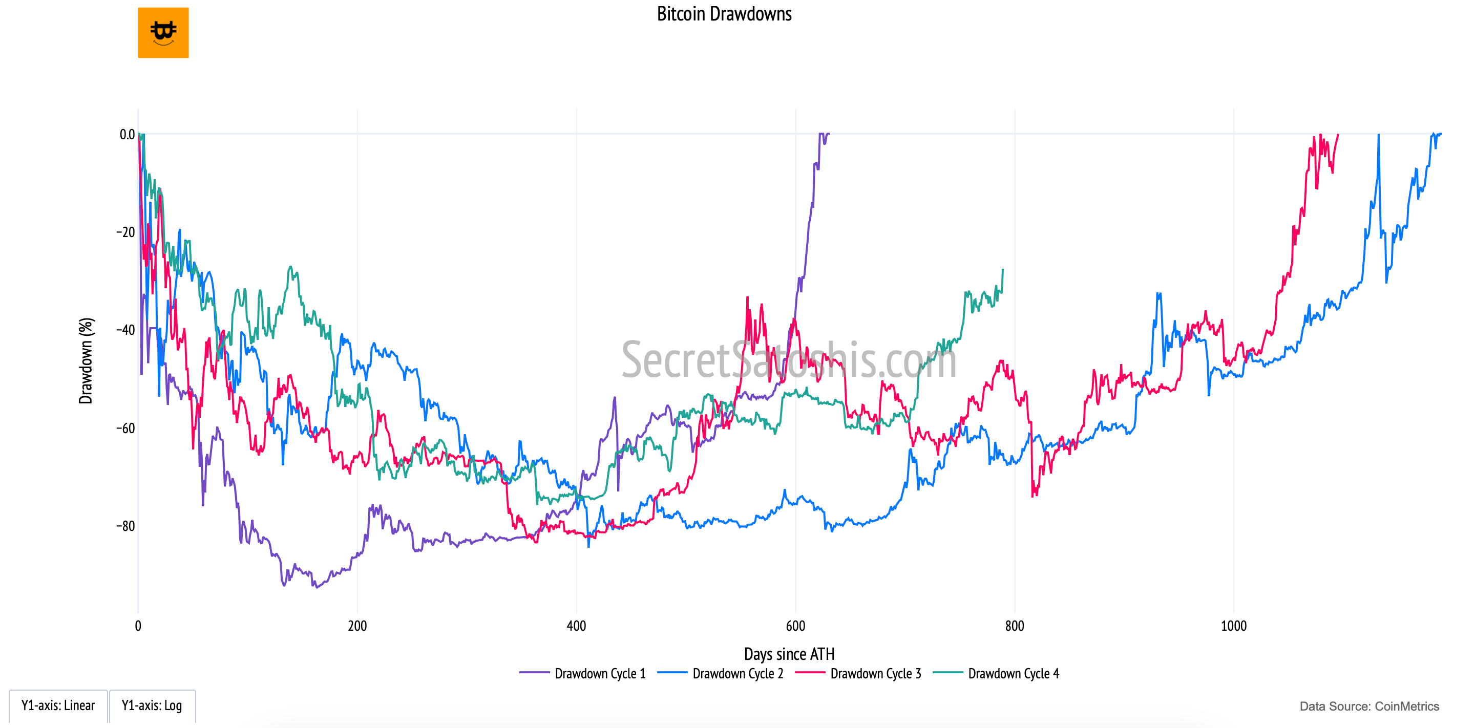
Drawdown Cycles (Multiple Colored Lines, Y-Axis): Each line represents a different market cycle, tracking the percentage decline from Bitcoin’s prior ATH and the subsequent recovery period.
X-Axis (Days Since ATH): Measures the duration of each drawdown and recovery in days, allowing for a direct comparison across different cycles.
Y-Axis (Drawdown Percentage): Indicates the severity of Bitcoin’s price decline from ATH, showing the depth of market corrections over time.
This metric highlights Bitcoin’s historical volatility and the cyclical nature of its price action. Each Bitcoin market cycle experiences:
A Major Correction – A significant price retracement, often exceeding -50%.
A Recovery Phase – A gradual return to previous highs as market fundamentals strengthen.
By analyzing Bitcoin’s past drawdowns, we can better contextualize its ability to recover and establish new ATHs, helping investors calibrate their expectations during periods of extreme volatility.
Bitcoin Return From Cycle Low
Introduction to bitcoin's market recovery
Bitcoin’s price cycles are marked by deep corrections followed by powerful recoveries. The “Return From Cycle Low” chart illustrates Bitcoin’s historical performance after reaching its lowest point in each market cycle. This metric provides a structured perspective on Bitcoin’s long-term price growth, demonstrating the asset’s resilience and ability to rebound from market downturns.
How to read the chart
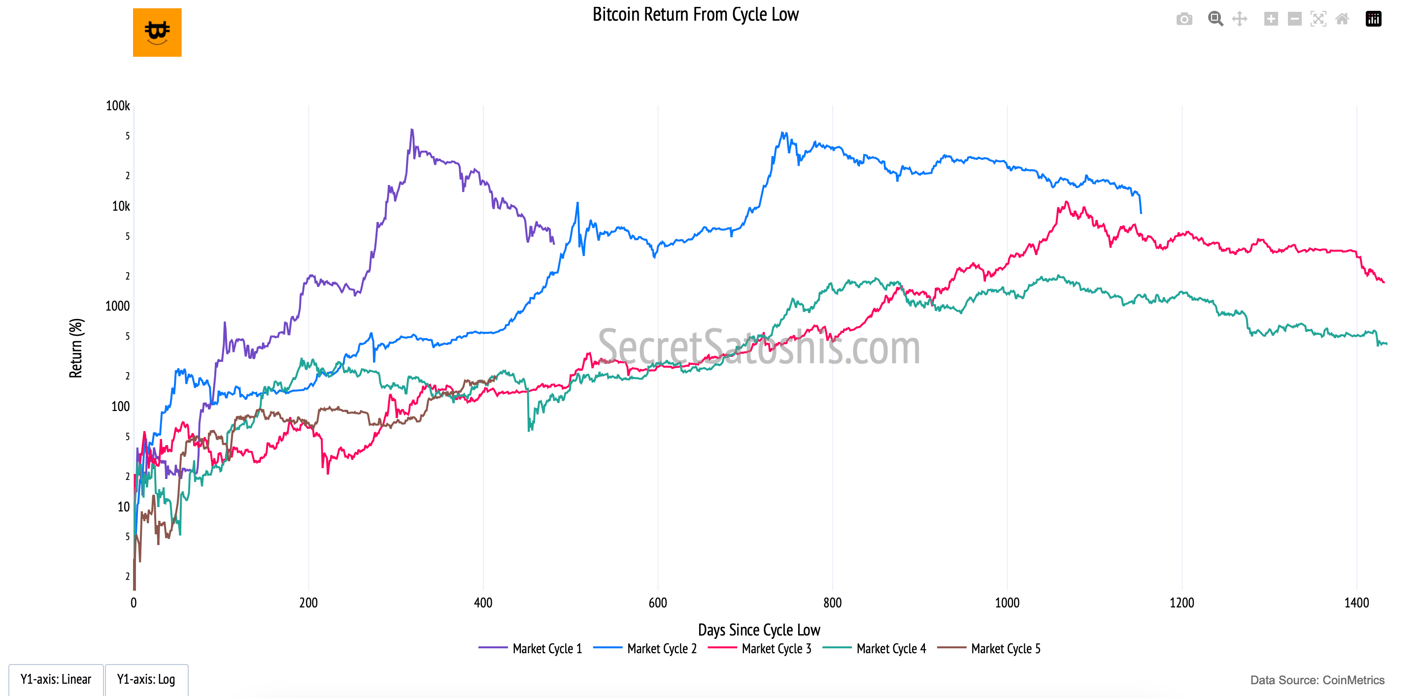
Market Cycles (Multiple Colored Lines, Y-Axis): Each line represents a different Bitcoin market cycle, tracking the percentage return from the lowest point of each cycle to the subsequent price peaks.
X-Axis (Days Since Cycle Low): Measures the duration of Bitcoin’s recovery, allowing direct comparisons of how long it takes for each cycle to rebound.
Y-Axis (Return Percentage, Log Scale): Displays Bitcoin’s recovery in percentage terms, using a logarithmic scale to highlight both smaller early-cycle gains and exponential long-term growth.
This chart emphasizes the cyclical nature of Bitcoin’s price action, where periods of extreme drawdowns are followed by substantial price expansions.
Post-Bear Market Rebounds – Bitcoin has historically delivered exponential returns after finding a macro bottom.
Diminishing Gains Over Time – While Bitcoin’s percentage returns decrease with each cycle due to its growing market size, the pattern of cyclical recovery remains consistent.
Time-Based Comparisons – Evaluating past recovery trends helps investors assess whether Bitcoin’s current price action aligns with historical post-cycle low behavior.
The “Return From Cycle Low” chart provides an analytical framework for understanding Bitcoin’s long-term price trends. While past performance is not a guarantee of future results, the consistency of Bitcoin’s cyclical recoveries suggests that, despite volatility, Bitcoin has continued to establish higher price floors over time.
Bitcoin Halving Cycle Return
Introduction to bitcoin's halving impact
The “Bitcoin Halving Return” chart provides a structured framework for understanding how Bitcoin’s price has historically responded to halving events. Each halving, which occurs approximately every four years, reduces the block reward given to miners by 50%, effectively slowing the issuance of new Bitcoin. This supply shock has been a key driver of Bitcoin’s cyclical price patterns, making halvings a critical factor in long-term valuation models.
How to read the chart
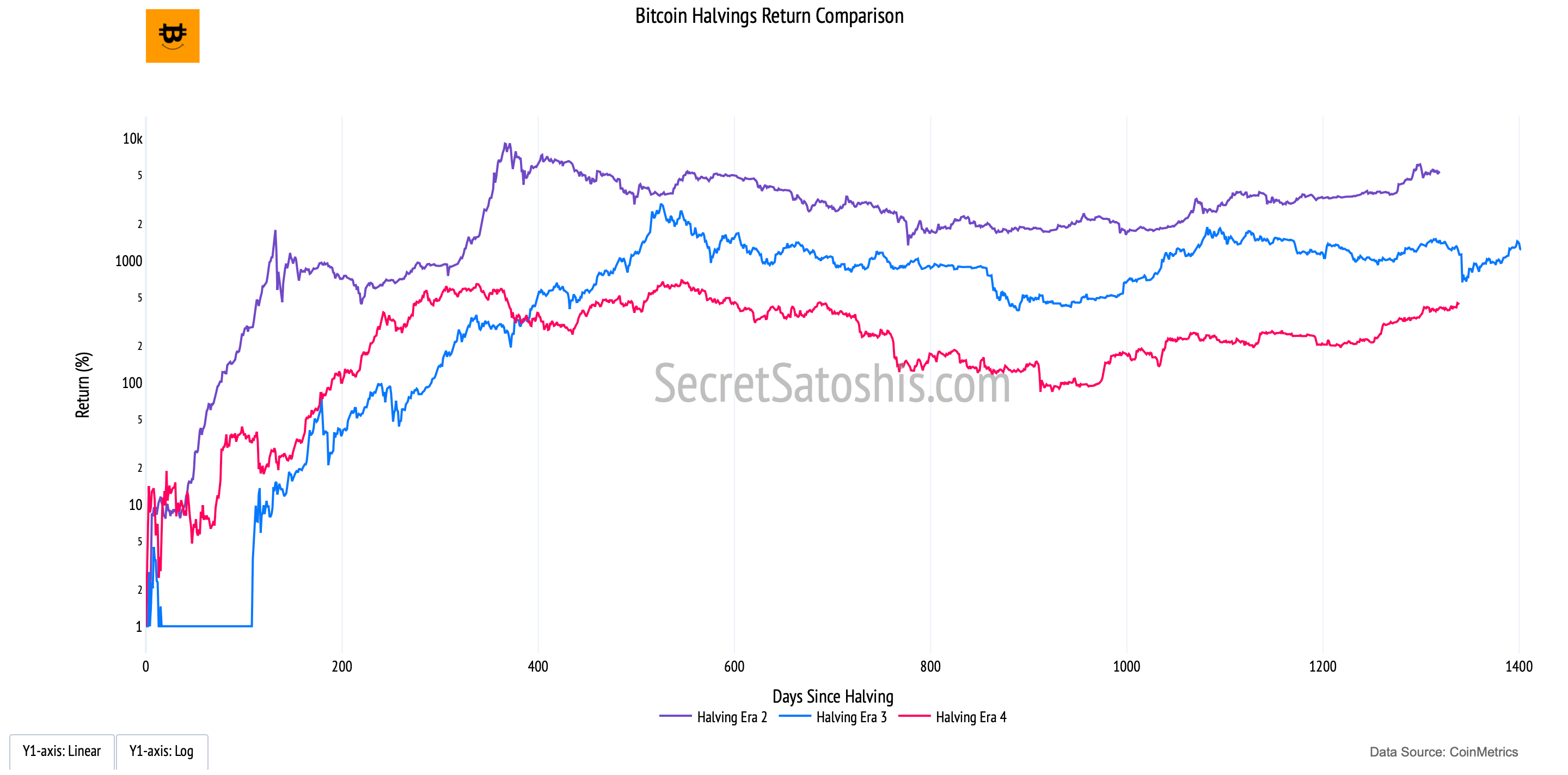
Halving Cycles (Colored Lines, Y-Axis): Each line represents Bitcoin’s percentage return following a specific halving event, illustrating the price trajectory after supply reductions.
X-Axis (Days Since Halving): Measures the time elapsed since each halving event, allowing comparisons between different halving eras.
Y-Axis (Return Percentage, Log Scale): Captures Bitcoin’s exponential price growth post-halving, using a logarithmic scale to contextualize both early-stage and later-stage returns.
The Bitcoin halving mechanism is rooted in the principles of supply and demand economics. With fewer new bitcoins entering circulation after each halving, past cycles have shown a tendency for supply-side constriction to coincide with long-term price appreciation.
Supply Shock – The reduction in new issuance decreases the available supply of Bitcoin, potentially driving price appreciation if demand remains constant or increases.
Historical Patterns – Previous halvings have preceded multi-year bull markets, reinforcing the idea that supply-side constraints play a role in shaping Bitcoin’s price trajectory.
Diminishing Returns – While Bitcoin’s absolute returns have decreased with each halving cycle, the long-term trend has consistently resulted in higher price floors over time.
At its core, the Bitcoin Halving Return chart illustrates the effects of programmed scarcity in a free-market system. The controlled issuance model, combined with increasing global adoption, underpins Bitcoin’s deflationary nature. While no model is predictive with certainty, historical halvings have demonstrated a correlation with long-term price appreciation, reinforcing Bitcoin’s role as a scarce and valuable digital asset.
For investors, this metric serves as a historical benchmark, offering insights into how Bitcoin has responded to halvings in the past and how these events may continue to influence future market cycles.
Bitcoin 4 Year Compound Annual Growth Rate
Introduction to bitcoin's annual growth
The “4-Year Compound Annual Growth Rate (CAGR)” chart provides a structured framework for analyzing Bitcoin’s long-term price appreciation. By smoothing out short-term volatility, this metric reveals the sustained growth trajectory of Bitcoin, illustrating its ability to generate consistent returns over multiple market cycles.
How to read the chart
Bitcoin Price (Orange Line, Left Y-Axis): Tracks Bitcoin’s daily closing price in USD, providing a reference for its historical performance.
4-Year CAGR (Blue Line, Right Y-Axis): Represents Bitcoin’s annualized growth rate over rolling four-year periods, offering a smoothed measure of Bitcoin’s long-term return trends.
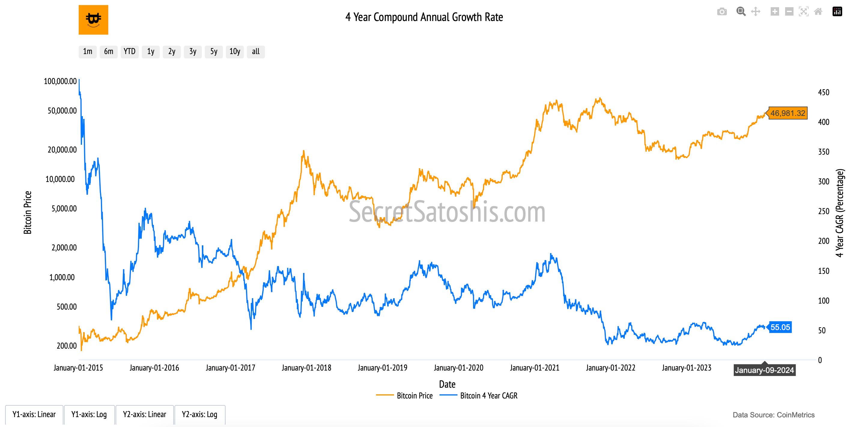
The Compound Annual Growth Rate (CAGR) quantifies Bitcoin’s average yearly return over a four-year period. Rather than measuring short-term price fluctuations, the CAGR provides a steady rate of return, helping to illustrate Bitcoin’s resilience and long-term price appreciation.
At its core, the 4-Year CAGR highlights Bitcoin’s exponential growth potential in a fixed-supply system. Unlike traditional assets subject to inflationary pressures, Bitcoin’s programmed scarcity and increasing adoption contribute to a consistent long-term appreciation.
Long-Term Growth Signal – A sustained positive CAGR underscores Bitcoin’s ability to generate consistent returns across multiple market cycles.
Mitigating Short-Term Noise – This metric filters out market fluctuations, emphasizing Bitcoin’s role as a maturing financial asset.
The Power of Compounding – As Bitcoin’s adoption curve expands, its cumulative annual returns reinforce its position as a long-term store of value.
By analyzing the Bitcoin Price alongside its 4-Year CAGR, investors gain a comprehensive perspective on Bitcoin’s historical performance, helping to contextualize its long-term trajectory within the broader financial landscape.
Bitcoin Year-Over-Year Return
Introduction to bitcoin’s yearly growth
The “Year-Over-Year (YOY) Return” chart provides a structured view of Bitcoin’s price performance on an annualized basis. By comparing Bitcoin’s price today to its value exactly one year ago, this metric highlights Bitcoin’s cyclical nature, volatility, and long-term return potential in the broader digital asset landscape.
How to read the chart
Bitcoin Price (Orange Line, Left Y-Axis): Tracks Bitcoin’s daily closing price in USD, reflecting historical market trends and valuation shifts over time.
Year-Over-Year Return (Purple Line, Right Y-Axis): Measures the percentage change in Bitcoin’s price compared to the same date one year earlier, illustrating Bitcoin’s annual growth trajectory.
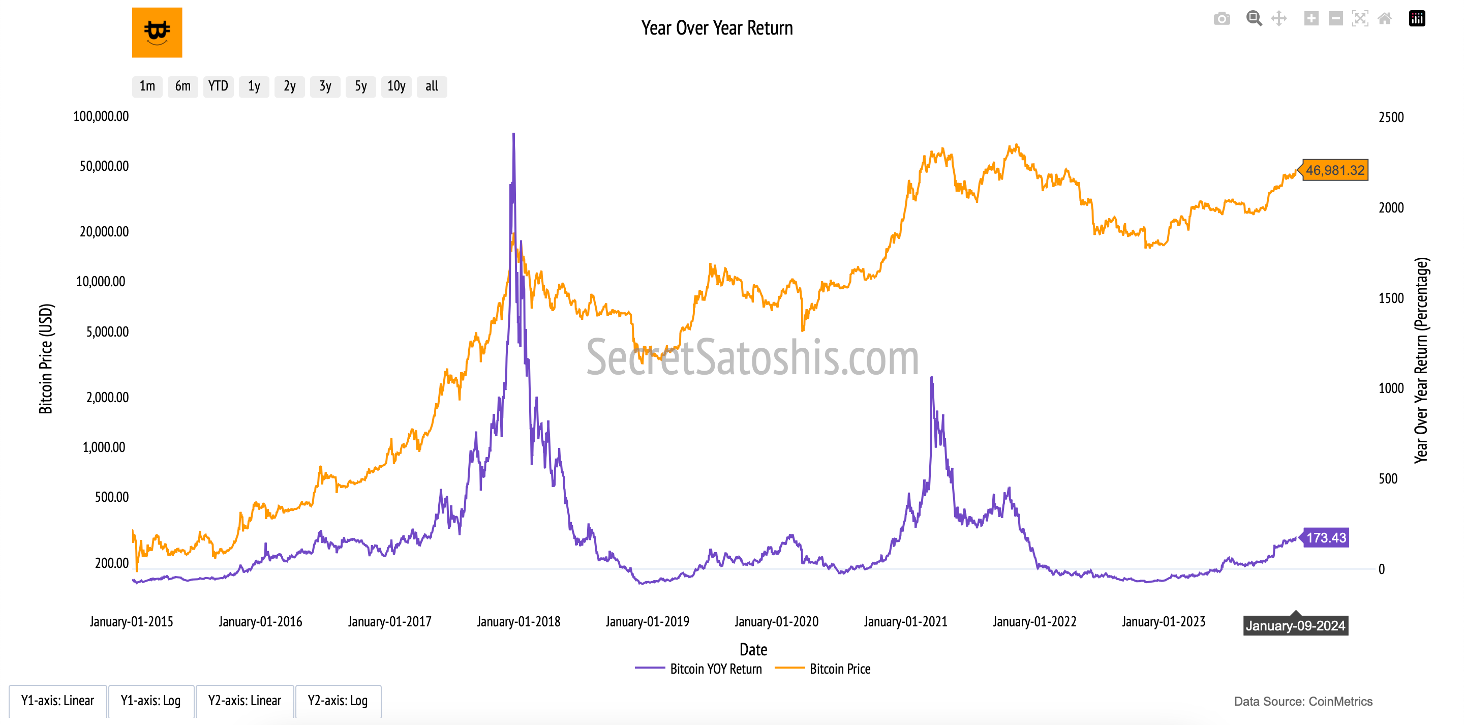
The Year-Over-Year Return (YOY Return) quantifies the percentage increase or decrease in Bitcoin’s price relative to its value on the same date one year prior.
At its core, the Year-Over-Year Return metric reflects Bitcoin’s cyclical price behavior and market maturation. This metric is crucial for assessing Bitcoin’s long-term adoption curve and price appreciation.
Market Expansion & Contraction – By observing yearly return trends, investors can identify periods of exponential growth (bull cycles) and market retractions (bear cycles), providing a structured view of Bitcoin’s cyclical nature.
Bitcoin’s Resilience Over Time – Despite annual fluctuations, Bitcoin has historically exhibited a strong recovery trend, reinforcing its store-of-value proposition.
Long-Term Trend Amid Volatility – While Bitcoin’s price experiences short-term corrections, the YOY Return metric highlights its ability to generate sustained returns over multiple years.
By examining Bitcoin’s Price alongside its YOY Return, investors can gain insight into the rhythm of Bitcoin’s market cycles, understanding its long-term trajectory through the lens of annualized performance and historical precedent.
Bitcoin Moving Averages
Introduction to bitcoin's average price
The “Bitcoin Price Moving Averages” chart provides a structured view of Bitcoin’s long-term price trends by smoothing out daily volatility. Moving averages (MAs) help market participants identify the prevailing direction of price movements, filtering out short-term fluctuations to highlight Bitcoin’s broader market momentum.
How to Read the Chart
Bitcoin Price (Orange Line, Left Y-Axis): Tracks Bitcoin’s daily closing price in USD, showing actual market movements over time.
50-Day Moving Average (Blue Line, Left Y-Axis): A short-term trend indicator that reacts quickly to price changes, often used to assess momentum shifts.
200-Day Moving Average (Red Line, Left Y-Axis): A long-term trend indicator that smooths out volatility, offering insights into broader market sentiment.
200-Week Moving Average (Green Line, Left Y-Axis): A macro-level price trend line that historically serves as a long-term support level.
200-Day Moving Average Multiple (Brown Line, Right Y-Axis): Represents Bitcoin’s market price relative to the 200-day MA, helping to gauge whether Bitcoin is trading above or below historical norms.

At its core, moving averages represent the average value of Bitcoin over different time horizons, capturing investor sentiment across various market conditions.
Short-Term (50-Day MA): Reacts quickly to price changes, often signaling market momentum shifts.
Long-Term (200-Day MA): A widely followed indicator that identifies sustained trends and market health.
Macro-Level (200-Week MA): Historically serves as a bear market support level, reflecting Bitcoin’s resilience over long periods.
The 200-Day MA Multiple provides further insight into whether Bitcoin’s price is in an extended bull or bear phase, offering a data-driven benchmark for evaluating cyclical trends.
By analyzing Bitcoin’s moving averages, investors gain a deeper understanding of how Bitcoin’s price evolves over time, reinforcing the principle that long-term trends often outweigh short-term volatility in shaping Bitcoin’s market structure.
Bitcoin Price Analysis Summary
Our exploration of Bitcoin’s price dynamics presents a structured framework for understanding its long-term market behavior. Through a range of price-focused metrics, we’ve examined Bitcoin’s resilience, cyclical trends, and its evolving role in the financial landscape.
We began by analyzing Bitcoin’s drawdowns from all-time highs (ATHs) and subsequent recoveries, highlighting the volatility inherent in Bitcoin’s price history. While these drawdowns illustrate the depth of market corrections, the recovery data underscores Bitcoin’s historical ability to reclaim and surpass previous highs, reinforcing its long-term trajectory.
The Return from Cycle Low metric further contextualizes Bitcoin’s price recovery by tracking its ascent from market cycle bottoms. This perspective provides a historical roadmap of Bitcoin’s ability to rebound following significant downturns, revealing a pattern of consistent price appreciation over time.
Bitcoin’s Halving Cycle Returns offer a unique lens into how Bitcoin’s supply dynamics influence its price. By systematically reducing the issuance rate, each halving event has historically acted as a catalyst for price expansions, reinforcing Bitcoin’s programmed scarcity as a fundamental driver of long-term valuation.
The 4-Year Compound Annual Growth Rate (CAGR) smooths out Bitcoin’s price volatility, revealing a steady growth trajectory across market cycles. By offering a long-term perspective on Bitcoin’s appreciation, this metric reinforces the asset’s historical resilience and upward momentum despite periods of short-term turbulence.
The Year-Over-Year (YOY) Return metric further refines our understanding of Bitcoin’s price movements by isolating annual growth rates. This measure provides a snapshot of Bitcoin’s relative performance across different years, offering insights into recurring cycles of expansion and contraction.
Finally, our examination of Bitcoin’s moving averages ties these insights together by presenting long-term trend indicators that filter out short-term noise. The 50-day, 200-day, and 200-week moving averages serve as critical reference points for assessing Bitcoin’s price momentum, market positioning, and potential trend reversals.
By integrating these market-based price frameworks, we gain a deeper appreciation for Bitcoin’s cyclical nature and its capacity for sustained growth. While short-term volatility remains a defining characteristic, Bitcoin’s historical performance suggests a strong underlying trend of value appreciation. Each of these metrics provides a unique vantage point, equipping investors with a comprehensive toolkit for evaluating Bitcoin’s price evolution and market positioning in an ever-changing financial landscape.