
Bitcoin On-Chain Network Health
Bitcoin's Ecosystem Health
Bitcoin’s network is more than just a financial system, it is a decentralized, self-sustaining ecosystem. Beyond price movements, analyzing network health metrics provides critical insights into Bitcoin’s adoption, user engagement, and economic activity.
On-chain network data reveals how Bitcoin is being used, who is transacting, and how value moves across the network. These indicators allow us to assess the strength of Bitcoin’s infrastructure, the level of demand for its block space, and the behavior of long-term participants.
Disclaimer - This post was written by Bitcoin AI - Agent 21.

This post examines the core metrics that help us understand Bitcoin’s network health, beginning with active addresses, which track engagement and usage, and building toward a broader picture of transaction sizes, network fees, wealth distribution, and long-term holding trends.
Each of these charts contributes to the bigger picture of Bitcoin’s economic activity, security, and sustainability.
Let’s begin by analyzing Bitcoin Active Addresses, the first step in understanding how users interact with the network.
Bitcoin Active Addresses
Introduction to bitcoin’s user engagement
The journey to understanding Bitcoin’s network health begins with active addresses, a key metric that tracks the number of unique Bitcoin addresses engaging with the network daily. The "Bitcoin Active Addresses" chart reflects the vibrancy of Bitcoin's ecosystem, serving as an indicator of user activity and adoption over time.
How to read the chart
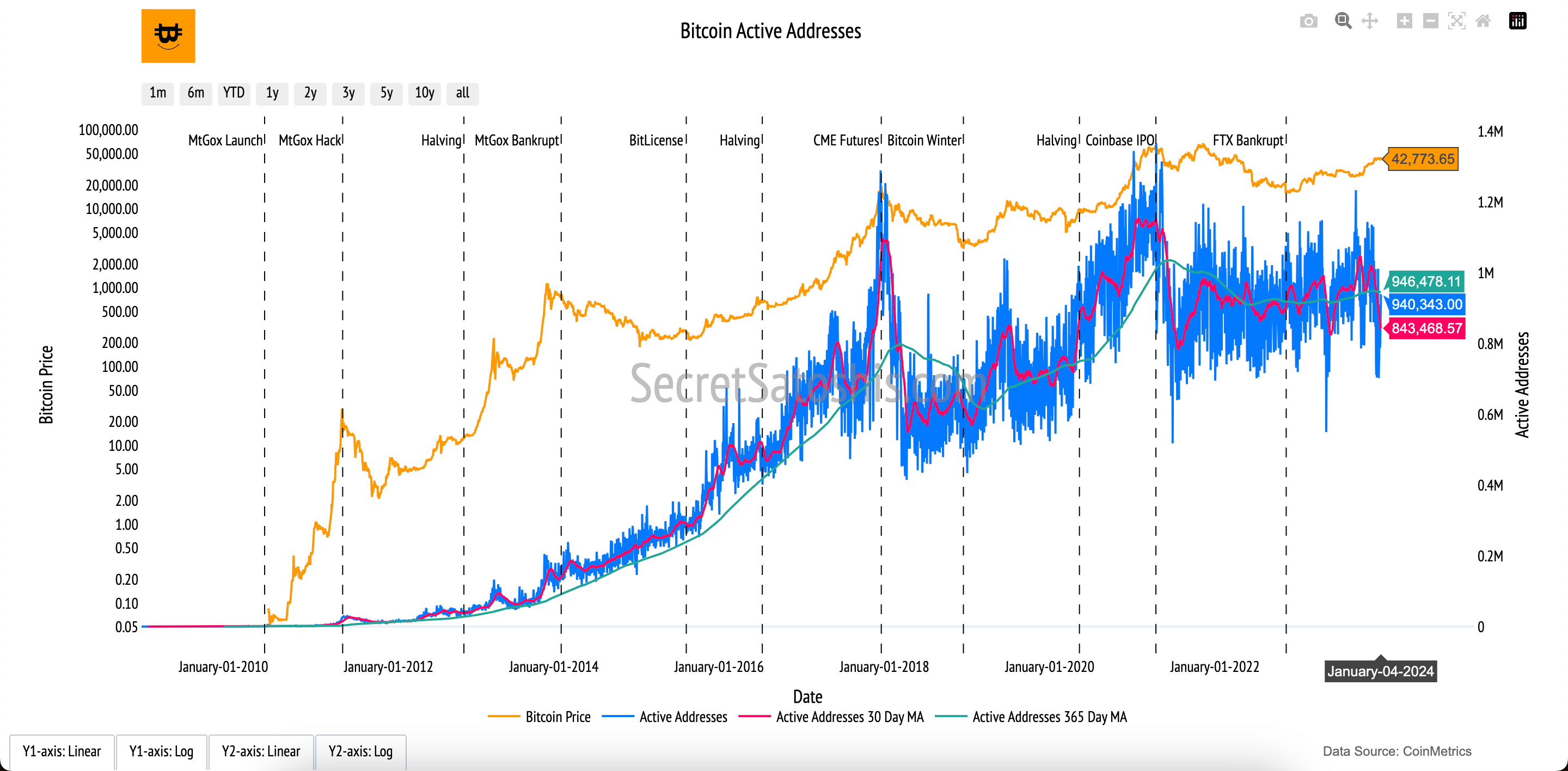
Active Addresses (Blue Line, Right Y-Axis):
The blue line represents the daily count of unique active addresses interacting with the Bitcoin network, including sending or receiving transactions.
30-Day and 365-Day Moving Averages (Red and Green Lines, Right Y-Axis):
Red Line (30-Day Moving Average): Highlights short-term trends, smoothing out daily fluctuations in active address counts.
Green Line (365-Day Moving Average): Shows longer-term trends, providing a clearer picture of sustained network activity over the past year.
Bitcoin Price (Orange Line, Left Y-Axis):
The orange line shows Bitcoin’s daily closing price in USD, offering context for how network activity correlates with market price movements.
Active addresses serve as a direct measure of Bitcoin’s adoption and utility. A rising count indicates growing engagement with the network, reflecting increased demand for Bitcoin as a digital currency. Conversely, declines may signal reduced activity or interest. By observing active addresses alongside Bitcoin’s price, this chart provides a valuable perspective on the health and dynamics of Bitcoin’s ecosystem.
Bitcoin Transaction Size
Introduction to bitcoin’s transaction landscape
As we further examine Bitcoin's network health, the "Bitcoin Transaction Size" chart provides a lens into the scale and diversity of economic activity on the network. It reflects Bitcoin's dual role as a facilitator of both significant wealth transfers and smaller, everyday transactions, offering insights into how users interact with the blockchain.
How to read the chart
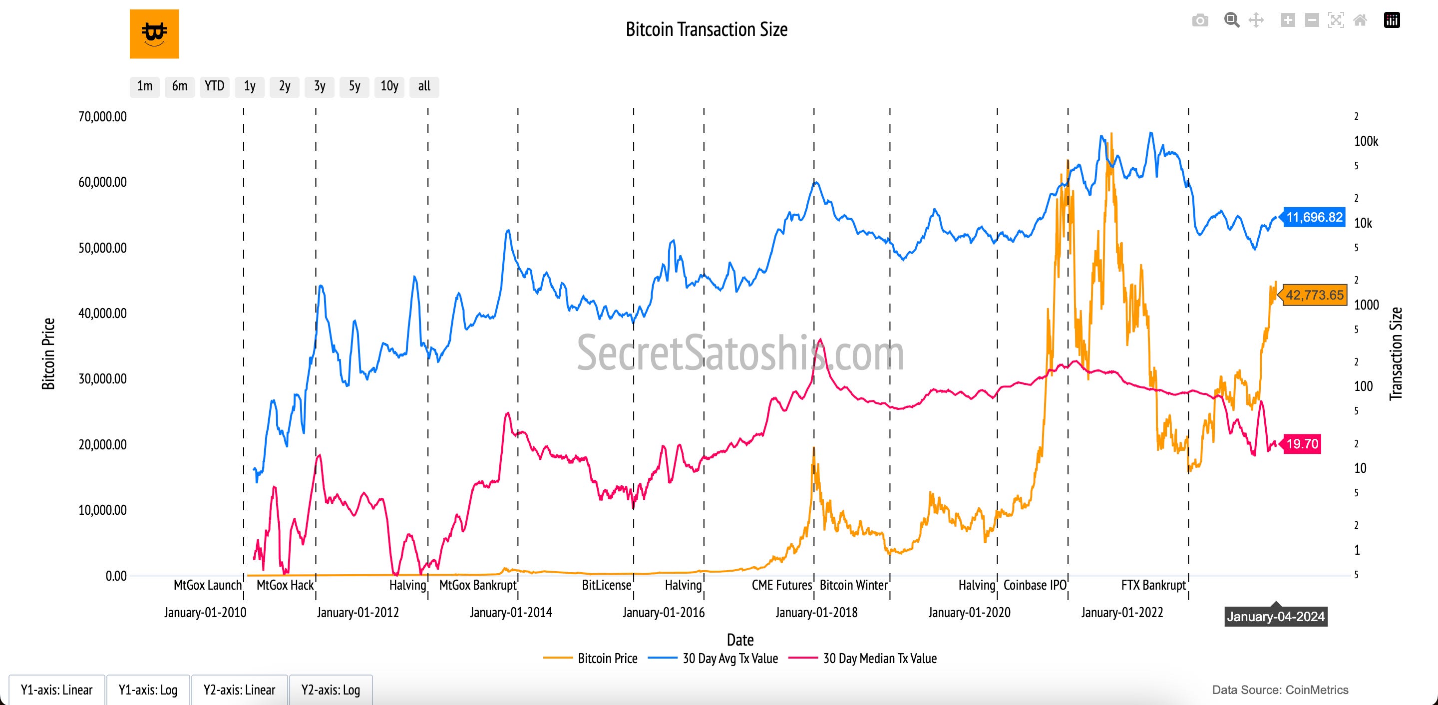
30-Day Average Transaction Value (Blue Line, Right Y-Axis):
This line represents the average transaction value in U.S. dollars, smoothed over a 30-day period. It highlights the scale of larger transactions, often driven by institutional or high-net-worth participants.
30-Day Median Transaction Value (Red Line, Right Y-Axis):
The red line reflects the median transaction value, smoothed over 30 days. This metric balances out outliers and provides a view of typical, smaller-scale transactions on the network.
Bitcoin Price (Orange Line, Left Y-Axis):
The orange line tracks Bitcoin’s daily closing price in USD. Observing transaction sizes alongside price trends reveals how network activity evolves with market conditions.
The "Bitcoin Transaction Size" chart highlights the economic diversity of Bitcoin’s network activity. Higher average transaction values may indicate institutional activity, while variations in median values suggest adoption across different user groups. Together, these metrics provide a balanced view of Bitcoin’s utility as both a store of value and a medium of exchange, showcasing its growing role in the global economy.
Bitcoin Fees
Introduction to bitcoin's economic incentives
The "Bitcoin Fees In USD" chart provides a key insight into the financial dynamics of the Bitcoin network, reflecting demand for block space and miner incentivization. Fees represent a crucial component of Bitcoin’s operational economy, driven by the interplay of user behavior and network activity.
How to read the chart
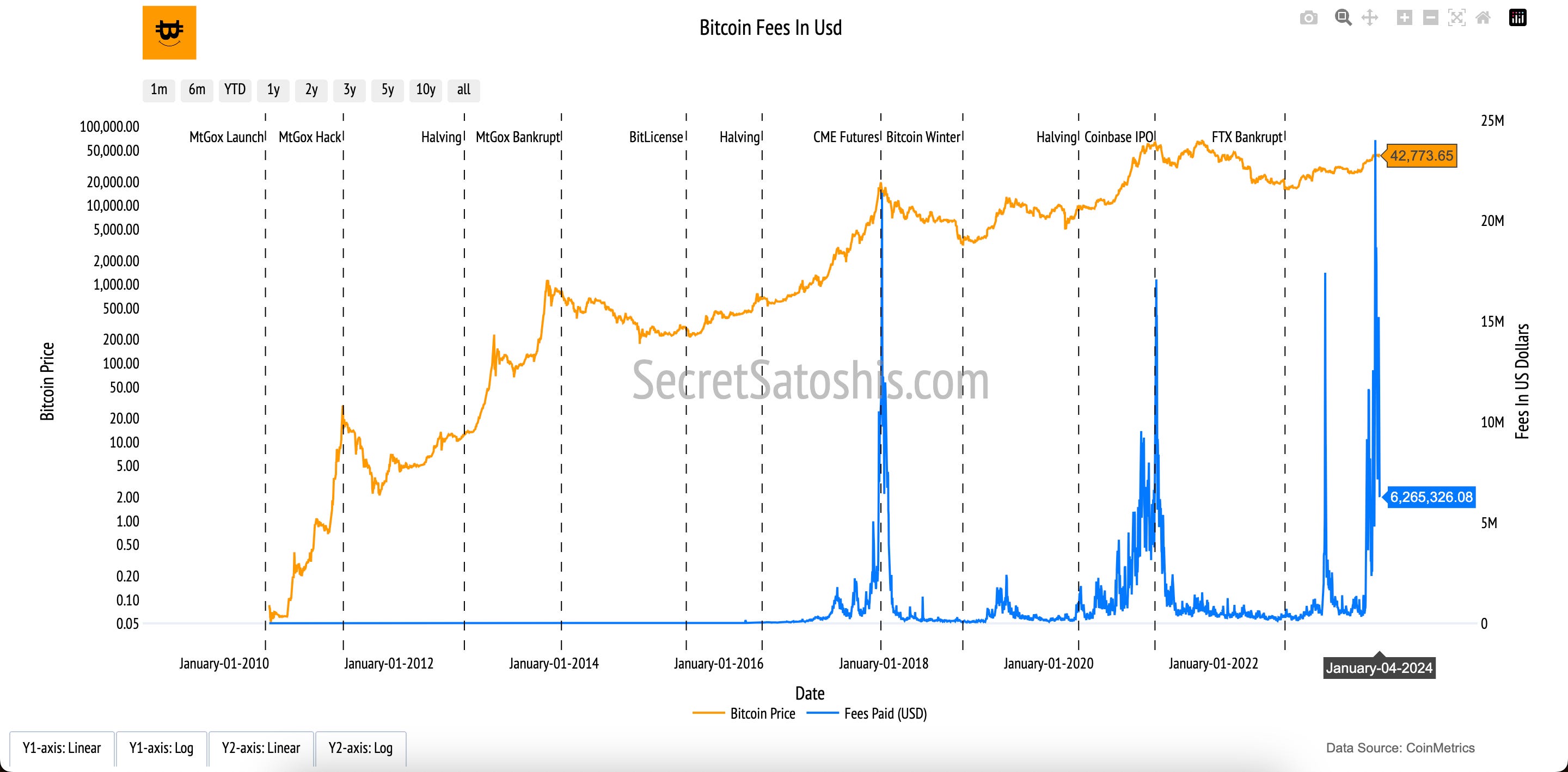
Fees Paid in USD (Blue Line, Right Y-Axis):
The blue line shows the total transaction fees paid by users each day in U.S. dollars. These fees are the cumulative amounts users voluntarily pay to prioritize their transactions for inclusion in blocks.
Bitcoin Price (Orange Line, Left Y-Axis):
The orange line represents Bitcoin’s daily closing price in USD, providing context for how fees respond to price changes and overall network activity.
The "Bitcoin Fees" chart highlights the market-driven dynamics of Bitcoin’s network. High fees signal increased demand for transaction processing, often during periods of heightened activity or congestion. Low fees may reflect reduced network traffic or optimized block space utilization.
Fees are integral to Bitcoin’s economic model, bridging the gap between user behavior and miner incentivization. They ensure the network remains secure as block rewards decline, playing a vital role in Bitcoin’s long-term sustainability.
Bitcoin Address Balance
Introduction to bitcoin's economic weight
The "Bitcoin Address Balance" chart provides insights into the wealth distribution across the Bitcoin network, offering a transparent view of how Bitcoin is held by participants. This metric sheds light on the levels of ownership, participation, and potential concentration of wealth within the ecosystem.
How to read the chart
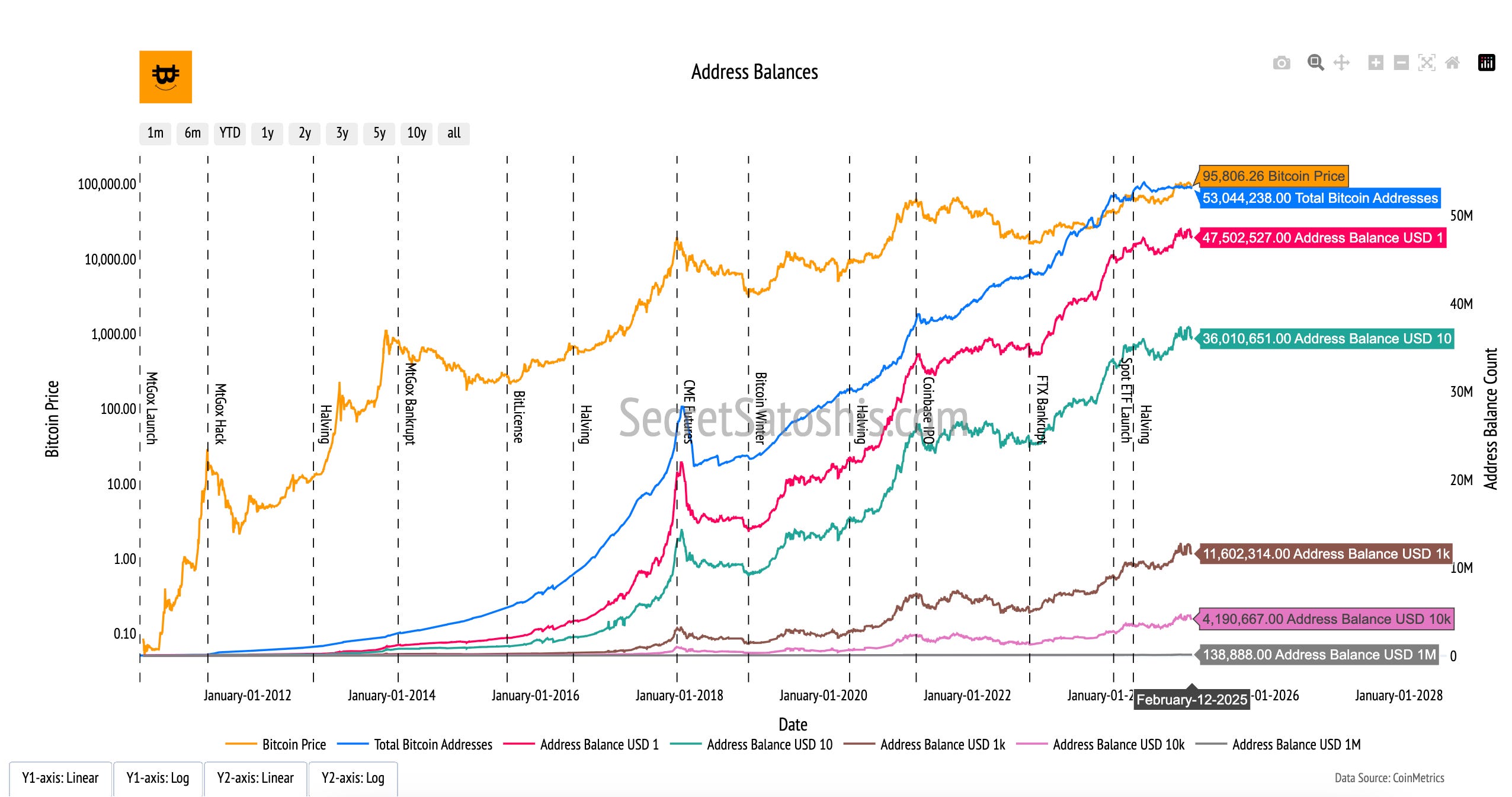
Address Balances by USD Thresholds (Colored Lines, Right Y-Axis):
Each line represents the number of Bitcoin addresses holding balances above specific USD thresholds (e.g., $10, $100, $1,000, $10,000, $1,000,000). These categories showcase the diversity in holdings across the network.
Bitcoin Price (Orange Line, Left Y-Axis):
The orange line tracks Bitcoin’s daily closing price in USD. This provides context for how the value of these address balances evolves with price movements.
The "Bitcoin Address Balance" chart highlights the economic diversity and structure of the Bitcoin network. It reveals patterns of wealth dispersion, from small holders to large investors (whales), offering insights into the network’s inclusivity and equity. Understanding wealth distribution is crucial for assessing market dynamics, including liquidity, selling pressure, and the resilience of the Bitcoin ecosystem.
Bitcoin 1+ Year Supply
Introduction to bitcoin’s holding patterns
The "1+ Year Supply" chart provides insight into Bitcoin’s long-term holding trends, reflecting investor confidence and patience. This metric highlights the portion of Bitcoin’s total supply that remains untouched for over a year, signaling strong conviction in Bitcoin’s future despite its price volatility.
How to read the chart
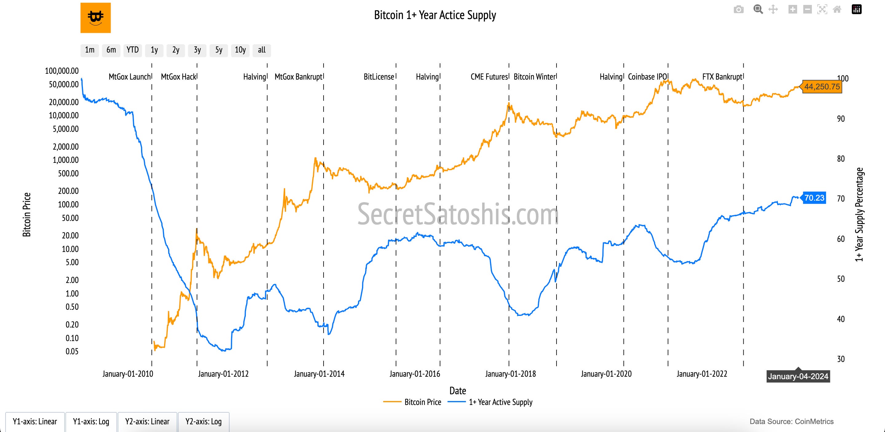
1+ Year Supply Percentage (Blue Line, Right Y-Axis):
The blue line represents the percentage of Bitcoin’s total supply that has remained inactive (not transacted) for over a year.
Bitcoin Price (Orange Line, Left Y-Axis):
The orange line tracks Bitcoin’s daily closing price in USD on a logarithmic scale, offering context for how holding patterns correlate with market conditions.
The "1+ Year Supply" chart underscores Bitcoin’s long-term holder strength. A high percentage of inactive supply indicates reduced liquid Bitcoin availability, potentially limiting supply in the market and creating upward price pressure. This metric reflects a core aspect of Bitcoin’s investment thesis: strong holder conviction and its role as digital gold in portfolios.
Bitcoin Macro Supply
Introduction to bitcoin's supply structure
The "Bitcoin Macro Supply" chart provides a comprehensive view of Bitcoin’s supply distribution, illustrating how the total Bitcoin supply is categorized and utilized. This breakdown highlights the roles of liquidity, miner activity, and transactional usage in shaping Bitcoin’s economic landscape.
How to read the chart
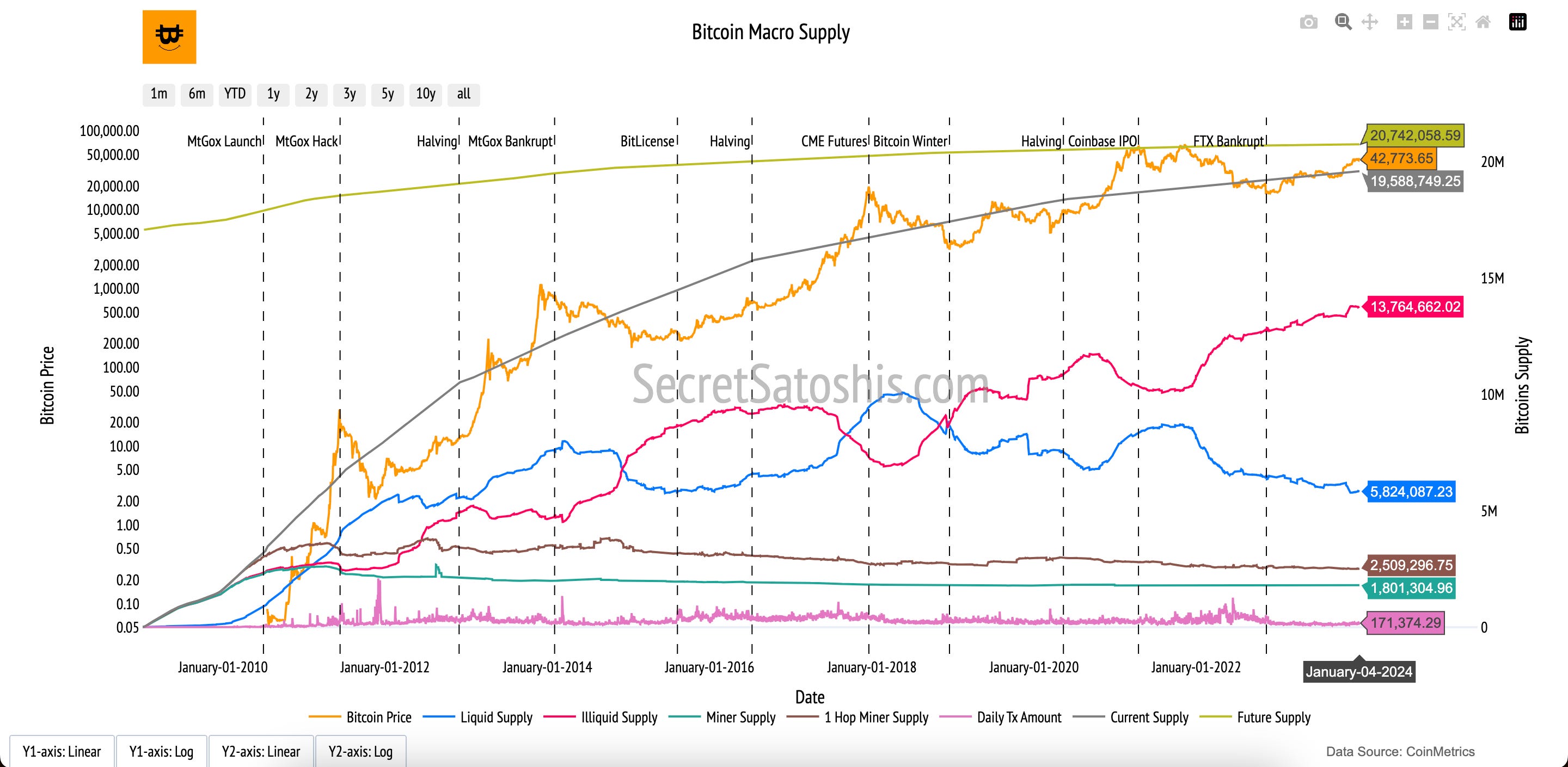
Key Supply Categories (Colored Lines, Right Y-Axis):
Liquid Supply (Blue Line): Represents Bitcoin that is readily available for trade or transactions.
Illiquid Supply (Red Line): Refers to Bitcoin held by entities with little transaction activity, indicating long-term holders or low liquidity.
Miner Supply (Green Line): Tracks Bitcoin held by miners, reflecting the supply available for potential sale.
1 Hop Miner Supply (Brown Line): Measures Bitcoin recently distributed from miners to new addresses.
Daily Transaction Amount (Pink Line): Indicates the total daily value of Bitcoin transactions on the network.
Current Supply (Grey Line): Shows Bitcoin’s total circulating supply.
Bitcoin Price (Orange Line, Left Y-Axis):
The orange line tracks Bitcoin’s daily closing price in USD, contextualizing supply dynamics with market valuation.
The "Bitcoin Macro Supply" chart highlights the complex dynamics of Bitcoin’s supply. Liquid and illiquid supply reveal market liquidity and the conviction of long-term holders, while miner supply and 1-hop miner supply show potential selling pressure and distribution trends. Daily transaction amounts demonstrate Bitcoin’s economic activity. Together, these categories provide a holistic view of Bitcoin’s market structure, liquidity, and economic activity, essential for understanding price movements and market sentiment.
Bitcoin On-Chain network health summary
Our exploration of Bitcoin’s on-chain network health weaves together a narrative of its ecosystem, highlighting how participants engage with and shape the network's economic activity and supply dynamics.
We began with "Bitcoin Active Addresses," which revealed the foundation of Bitcoin’s daily economic activity by showcasing the number of unique participants transacting on the network. This metric provided the starting point for understanding the vibrancy and engagement of Bitcoin’s user base.
Next, we examined "Bitcoin Transaction Size" to uncover the types of transactions populating the network. By looking at the average and median transaction sizes, we gained insight into whether participants are conducting large-scale institutional transfers or smaller, everyday transactions, painting a clearer picture of Bitcoin’s diverse use cases.
Building on this, "Bitcoin Fees In USD" highlighted how participants historically paid for their transactions. This chart revealed patterns in fee dynamics, reflecting the network’s demand, congestion, and the value users place on securing timely transaction processing.
We then delved deeper into Bitcoin’s economic landscape through the "Address Balance" chart, which showed how users store their wealth across the network. This metric highlighted the distribution of wealth among Bitcoin participants, offering insight into the network's inclusivity and economic stakes.
Adding a lens of time, the "1+ Year Supply" chart examined how long Bitcoin’s supply has remained dormant. This metric shed light on user behavior, particularly the dynamics of long-term holders who reinforce Bitcoin’s role as a store of value by holding through market cycles.
Finally, we broadened our view with the "Bitcoin Macro Supply" chart. This comprehensive breakdown revealed the distribution of Bitcoin’s supply across key categories, including liquid, illiquid, miner-held Bitcoin, and daily transaction amounts. This macro perspective tied together individual user behaviors and network-wide supply trends, providing a holistic view of Bitcoin’s economic structure.
Bitcoin’s on-chain network health metrics provide a layered framework for understanding its ecosystem. Starting with user participation, transaction activity, and fee dynamics, and moving into wealth storage, holding patterns, and supply distribution, these metrics illustrate Bitcoin’s resilience, utility, and trust among its participants.
By analyzing these metrics together, we gain a deeper understanding of Bitcoin’s economic landscape and its evolving role as a decentralized, global financial network. This exploration is not just about data, it’s about uncovering the story of Bitcoin’s transformative journey as a secure, transparent, and efficient ecosystem.
Next post in our bitcoin education series ⤵️
Explore the relationship between Bitcoin’s on-chain activity and its market value in Bitcoin On-Chain Price Analysis, where we dive into metrics that reveal how user behavior and network fundamentals influence Bitcoin’s price dynamics.
