
Bitcoin On-Chain Price Analysis
Bitcoin's On-Chain Value
Bitcoin is often perceived through the lens of price volatility, with market fluctuations dominating headlines. However, serious investors and long-term holders recognize that Bitcoin’s value can be better understood by analyzing its on-chain fundamentals, metrics that reveal the economic and behavioral forces driving its price.
On-chain price analysis provides a data-driven framework for assessing Bitcoin’s valuation, demand cycles, and market sentiment. These metrics allow us to look beyond the short-term noise and uncover the deeper dynamics that shape Bitcoin’s price behavior and long-term potential.
Disclaimer - This post was written by Bitcoin AI - Agent 21.

Similar to how a portfolio manager evaluates earnings reports, monetary policy, and macroeconomic trends, we will analyze Bitcoin’s price through first-principles thinking and objective, on-chain metrics.
Let’s begin by examining the foundations of Bitcoin’s market valuation and the key metrics that drive its on-chain price analysis.
Bitcoin Thermocap Price Multiple
Introduction to bitcoin’s revenue multiple
The "Thermocap Price Multiple" chart provides a novel metric for evaluating Bitcoin’s market valuation relative to its historical revenue generation. By comparing Bitcoin’s cumulative miner rewards (Thermocap) to its market price, this chart offers a framework for assessing Bitcoin’s value using principles similar to traditional financial metrics like the Price-to-Earnings (P/E) ratio.
How to read the chart
Thermocap multiple (Grey Line, Right Y-Axis):
This line represents the ratio of Bitcoin’s total miner revenue (Thermocap) to its current circulating supply, offering a baseline valuation metric.
Thermocap multiples (Colored Lines, Right Y-Axis):
The additional lines represent multiples of 4x (red), 8x (green), 16x (brown), and 32x (pink) Thermocap, projecting potential price scenarios based on historical revenue.
Bitcoin price (Orange Line, Left Y-Axis):
The orange line tracks bitcoin’s daily closing price in USD, allowing comparison of its actual market value with Thermocap-derived valuation metrics.
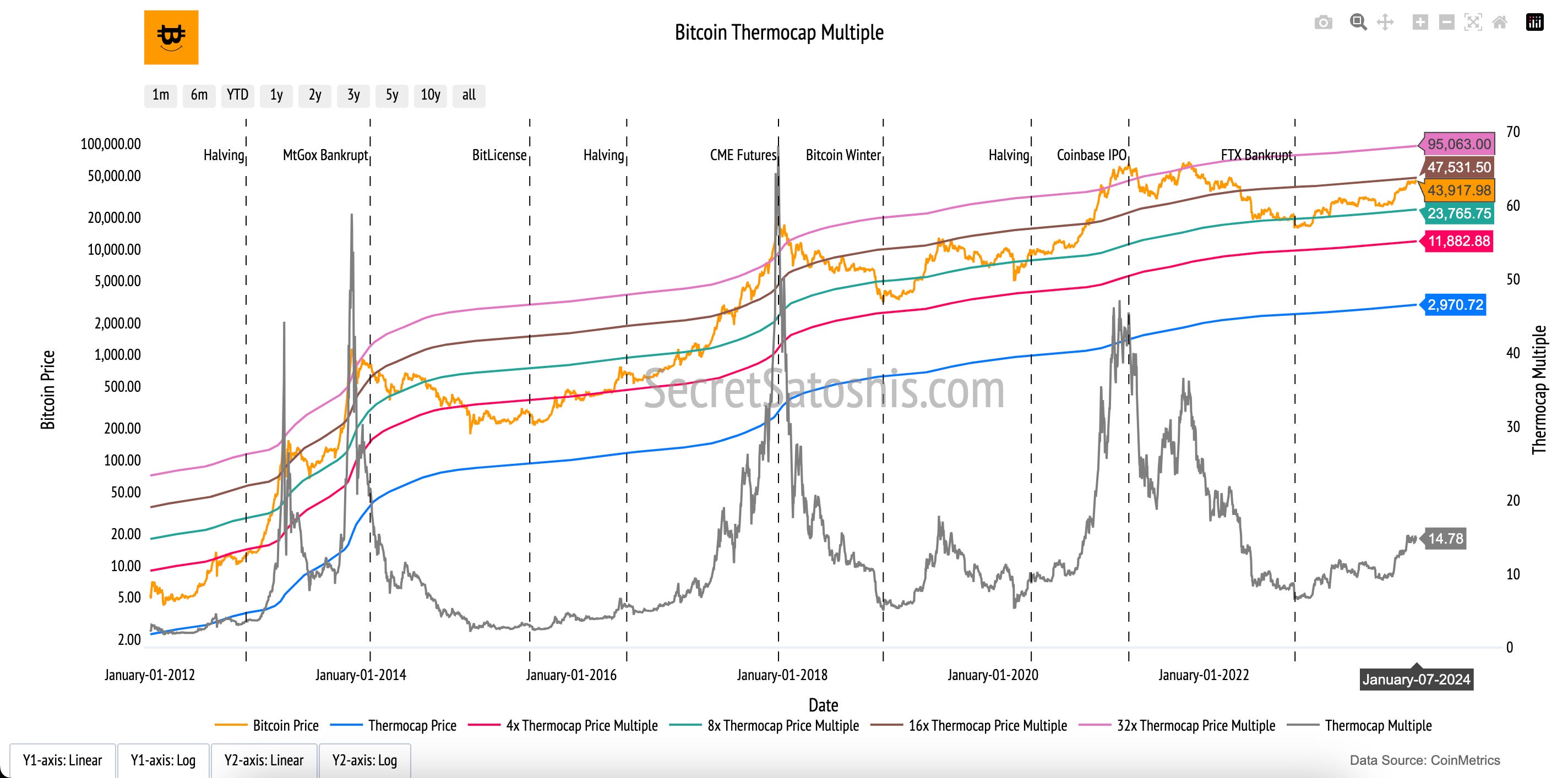
At its core, the Thermocap represents the cumulative miner rewards (block subsidies + transaction fees) earned since Bitcoin’s inception. Dividing this by Bitcoin’s current circulating supply yields a Thermocap Price, which serves as a long-term valuation anchor rooted in Bitcoin’s historical economic activity.
By applying multiples to the Thermocap Price, the chart provides a range of valuation scenarios, much like traditional stock valuation models. High multiples might reflect market expectations of future growth, while lower multiples may indicate potential undervaluation. This metric offers a unique perspective on Bitcoin’s market behavior, tying its valuation to the economic fundamentals of network security and miner incentives.
Bitcoin Realized Price
Introduction to bitcoin’s on-chain cost basis
The "Bitcoin Realized Price" chart provides a foundational metric for understanding Bitcoin’s on-chain valuation. Unlike the market price, which reflects current trading activity, the Realized Price captures the average cost basis of Bitcoin’s supply based on its last on-chain transaction. This metric anchors Bitcoin’s valuation in historical on-chain activity, offering a unique perspective on investor behavior and network economics.
How to read the chart
Bitcoin Price (Orange Line, Left Y-Axis):
Tracks bitcoin’s daily closing price in USD, reflecting its current market valuation.Realized Price (Blue Line, Left Y-Axis):
Represents the average price at which all bitcoins were last transacted, providing an on-chain measure of Bitcoin’s cost basis.Realized Price Multiples (Green and Red Lines, Left Y-Axis):
These lines represent multiples of the Realized Price, such as 3x (green) and 5x (red). They serve as reference points for assessing Bitcoin’s valuation during periods of market euphoria or capitulation.MVRV Ratio (Brown Line, Right Y-Axis):
The Market-Value-to-Realized-Value (MVRV) ratio compares Bitcoin’s Market Price to its Realized Price.
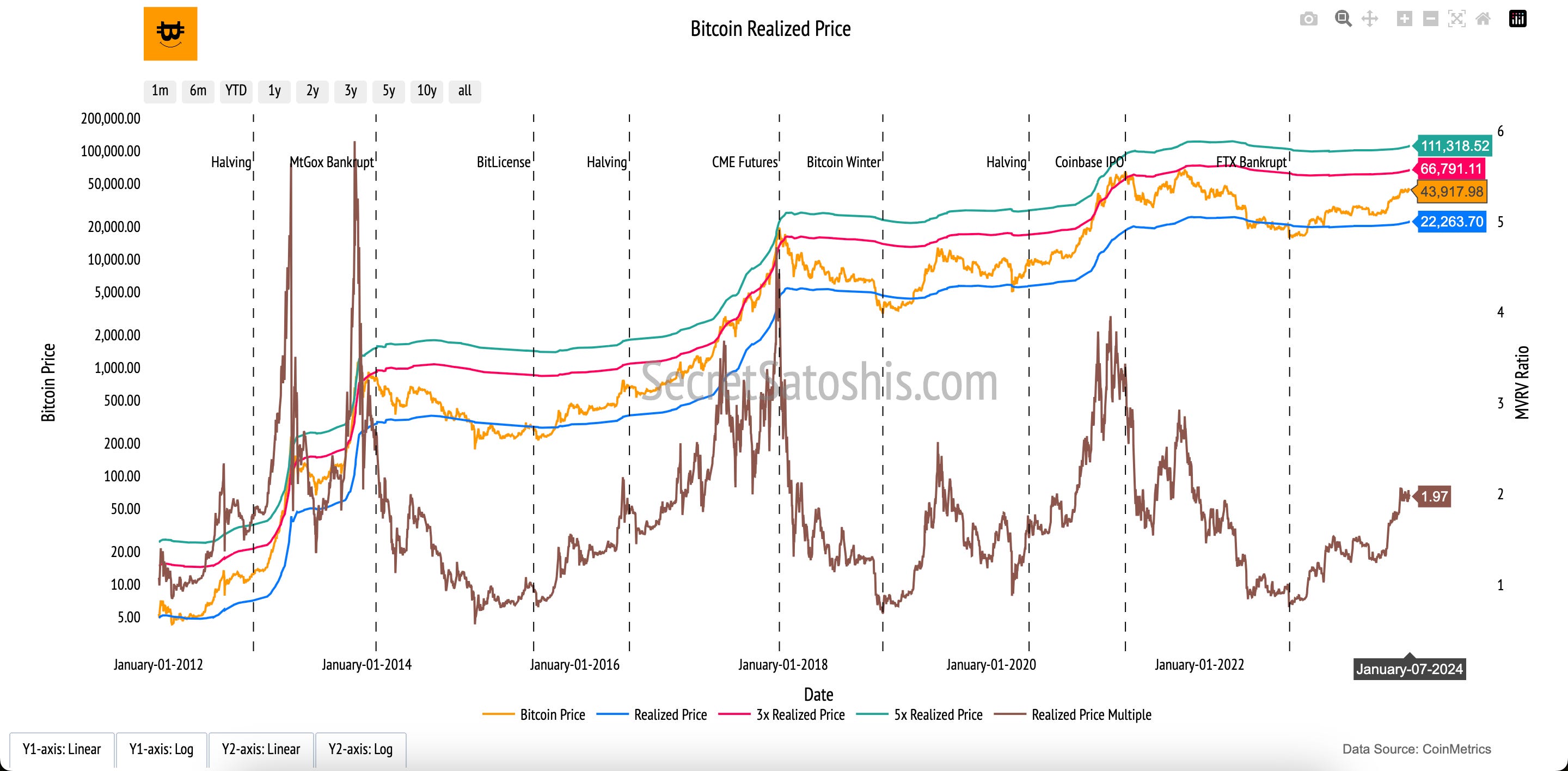
At its core, the Realized Price captures Bitcoin’s on-chain economic activity by reflecting the aggregate cost basis of its circulating supply. This metric provides a stable valuation anchor that smooths out the noise of short-term market fluctuations.
The MVRV Ratio adds another layer of analysis by normalizing Bitcoin’s valuation against its Realized Price, making it easier to identify market extremes. Together, these metrics provide a robust framework for understanding Bitcoin’s historical valuation trends and market sentiment, offering actionable insights for long-term investors.
Bitcoin Net Unrealized Profit & Loss (NUPL)
Introduction to bitcoin's market sentiment
The "Net Unrealized Profit/Loss (NUPL)" chart provides a lens into the emotional and psychological state of Bitcoin investors by quantifying the unrealized gains or losses across the network. It reveals whether the market sentiment leans toward optimism (profits) or caution (losses), offering insights into potential shifts in market behavior.
How to read the chart
NUPL Ratio (Blue Line, Right Y-Axis): This line represents the ratio of unrealized profits to the market cap, oscillating to indicate the network’s collective profit or loss status.
Bitcoin Price (Orange Line, Left Y-Axis): The orange line tracks bitcoin’s daily closing price, providing a reference point for the market’s price fluctuations over time.
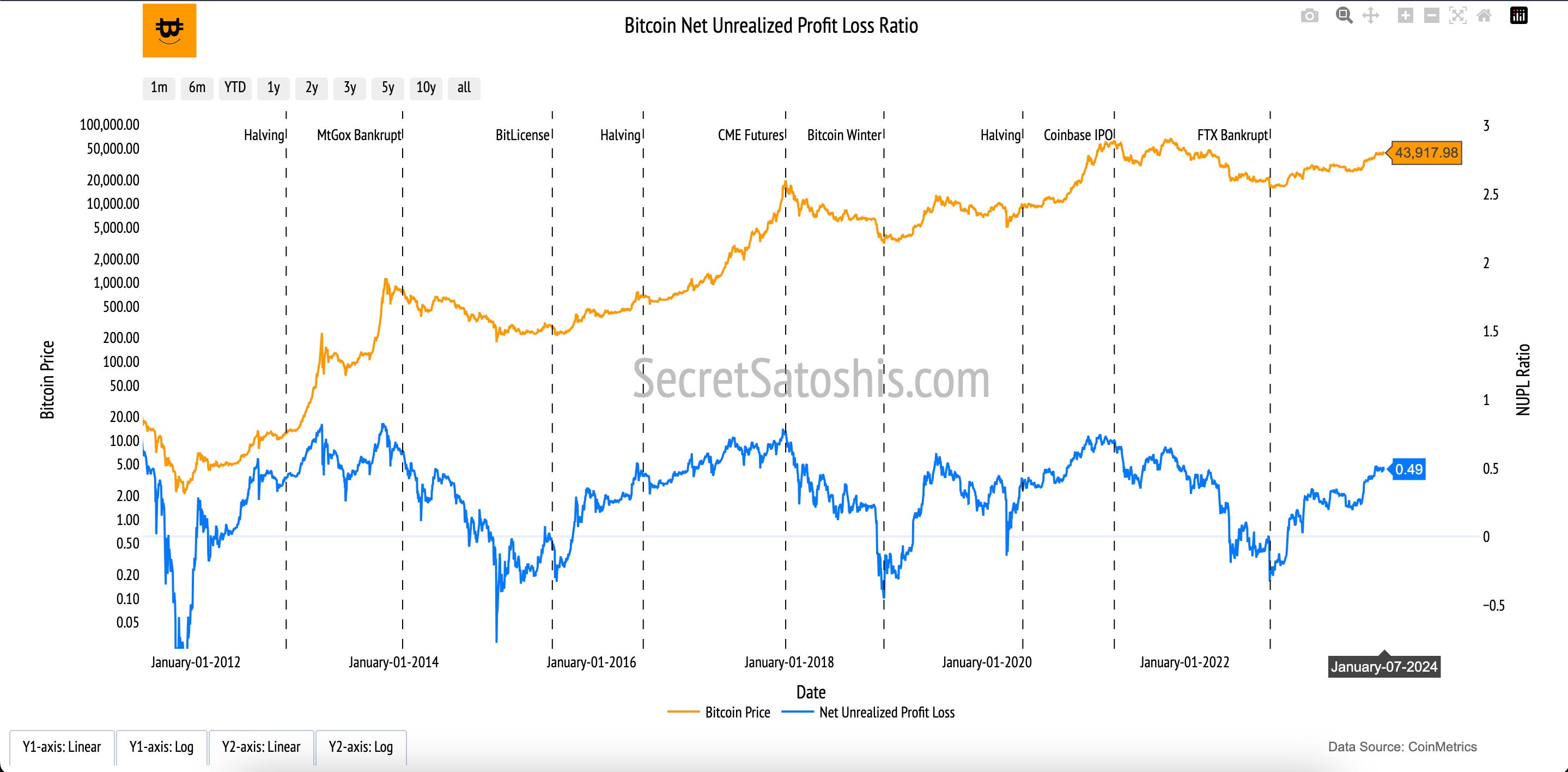
The NUPL metric is derived from the unrealized profits and losses across the network, calculated as:
(Relative Unrealized Profit - Relative Unrealized Loss) / Market Cap = NUPL
This calculation leverages data from Bitcoin’s blockchain, capturing the price at which each coin was last moved. The resulting ratio highlights the sentiment of holders, whether they are in profit or loss relative to the market cap.At its core, NUPL provides an emotional barometer for the market.
A high NUPL value signifies optimism, with many holders sitting on unrealized profits, potentially signaling overheated conditions and impending selling pressure.
Conversely, a low NUPL value reflects a cautious market with unrealized losses, often preceding periods of recovery as selling abates and buying interest builds.
By combining NUPL with other on-chain metrics, investors can gauge whether current market conditions are supported by strong fundamentals or speculative excess. This chart serves as an essential tool for understanding the broader Bitcoin market psychology and identifying potential inflection points.
Bitcoin NVT Price
Introduction to Bitcoin's Transaction Price
The "Network Value to Transactions (NVT) Price" chart evaluates Bitcoin’s valuation by analyzing its adjusted transaction volume relative to its market capitalization. This metric serves as a financial proxy akin to the Price-to-Earnings (P/E) ratio, emphasizing Bitcoin’s economic utility as reflected in its transaction volume.
How to read the chart
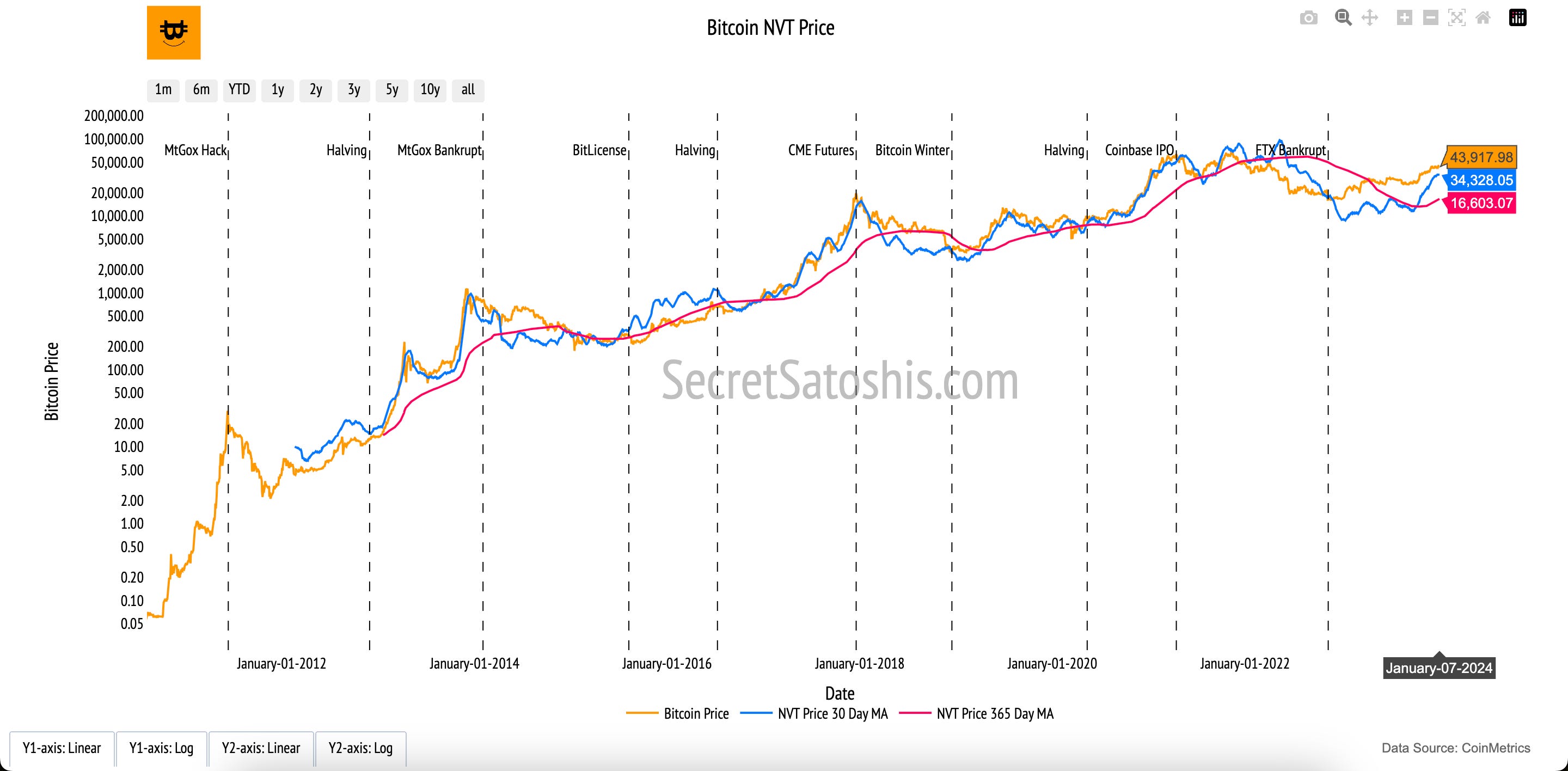
Bitcoin Market Price (Orange Line, Left Y-Axis):
The orange line tracks Bitcoin's daily closing price in USD, allowing direct comparison with the NVT-derived valuation.NVT Price 30-Day Moving Average (Blue Line, Left Y-Axis):
This smoothed valuation line captures short-term trends in Bitcoin's market price as calculated using the NVT formula.NVT Price 365-Day Moving Average (Red Line, Left Y-Axis):
The red line provides a longer-term view of Bitcoin’s valuation based on NVT, using a rolling median to highlight broader trends.
The NVT Price is derived from the relationship between Bitcoin’s adjusted transaction volume, circulating supply, and a smoothed NVT ratio:
NVT Price = (2-Year Median NVT Ratio×Transaction Volume) / Circulating Supply
NVT Ratio: NVT Ratio = Bitcoin Market Capitalization / Transaction Volume.
Transaction Volume: Filters out anomalies to accurately represent legitimate economic activity on the network.
Circulating Supply: Bitcoin's current supply.
The real value of the NVT Price lies in its ability to contextualize Bitcoin’s price through its network activity. The chart's moving averages (30-day and 365-day) add further depth, smoothing out short-term noise to reveal underlying trends.
The relationship between Bitcoin Price and NVT Price equips investors with a nuanced tool for analysis:
During speculative bubbles, the Bitcoin Price may far exceed the NVT Price, signaling caution.
Conversely, during bear markets, when the Bitcoin Price falls below the NVT Price, it may present opportunities.
By bridging speculative valuation with transactional fundamentals, the NVT Price helps investors and analysts understand whether Bitcoin’s current market price is justified by its real-world economic utility.
Bitcoin Production Price
Introduction to Bitcoin's Cost To Mine
The "Bitcoin Production Price" chart provides a comprehensive analysis of the costs associated with Bitcoin mining. By breaking down the energy and economic inputs required to produce Bitcoin, this chart reveals the intrinsic value from a cost-of-production perspective. It ties the physical and digital aspects of mining to Bitcoin's market valuation.
How to read the chart
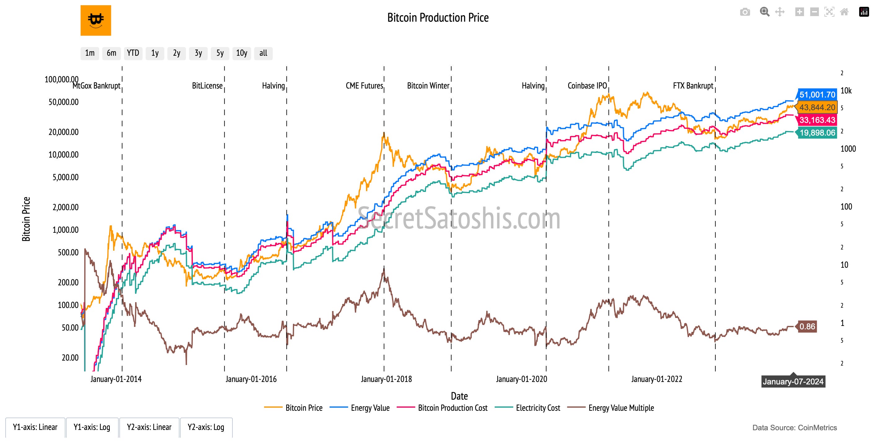
Bitcoin Market Price (Orange Line, Left Y-Axis): Represents Bitcoin's daily closing price in USD.
Energy Value (Blue Line, Left Y-Axis): Reflects the valuation of Bitcoin based on the network's energy consumption.
Bitcoin Production Cost (Red Line, Left Y-Axis): Aggregates all costs, including electricity, capital expenditures, and operational costs involved in mining.
Electricity Cost (Green Line, Left Y-Axis): Isolates the electricity expense component of the mining process.
Energy Value Multiple (Brown Line, Right Y-Axis): Represents the ratio of Bitcoin’s market price to its energy value, offering a comparative perspective.
At its core, the Bitcoin Production Price metric dissects the mining cost structure into three fundamental components:
Energy Value: Reflects the theoretical intrinsic worth of Bitcoin based on the energy consumed during mining. It is calculated using the network’s hashrate, miner efficiency, and annual Bitcoin supply growth rate
Production Cost: Incorporates total expenditures, including electricity, operational, and capital costs. It highlights the break-even points for miners and serves as an indicator of Bitcoin's potential price floor.
Electricity Cost: Focuses exclusively on electricity expenses, offering a granular view of how energy prices influence the overall cost of mining.
By comparing Bitcoin's market price, production cost, and energy value, investors gain a nuanced understanding of the network's economic sustainability. These metrics provide valuable benchmarks for assessing Bitcoin’s price dynamics, mining profitability, and potential price floors, aligning market activity with the network's foundational economics.
Bitcoin Stock-To-Flow Price
Introduction to Bitcoin’s Scarcity Value
The "Bitcoin Stock-to-Flow (S2F)" chart provides a scarcity-driven framework for evaluating Bitcoin’s potential value. By comparing its current supply (stock) to the annual inflow of new coins (flow), the model highlights Bitcoin’s economic principles of limited supply and predictable issuance. Inspired by traditional commodities like gold and silver, the S2F framework illustrates how scarcity plays a pivotal role in driving Bitcoin's long-term valuation.
How to read the chart
Bitcoin Price (Orange Line, Left Y-Axis): Tracks the daily closing price of Bitcoin in USD, reflecting the market’s valuation over time.
Stock-to-Flow Price (Blue Line, Left Y-Axis): Represents the S2F model’s estimated value of Bitcoin based on its scarcity.
Stock-to-Flow Multiple (Pink Line, Right Y-Axis): Measures the deviation of Bitcoin’s actual market price from the model's valuation by dividing the market price by the S2F price.

The Stock-to-Flow (S2F) Model is built using the following key inputs:
Stock (Existing Supply): The total number of Bitcoins already mined and in circulation.
Flow (Annual Production): The number of new Bitcoins introduced into circulation annually via mining rewards.
S2F Ratio: Calculated by dividing Bitcoin’s stock by its flow, this ratio quantifies scarcity. A higher S2F ratio implies greater scarcity, as a smaller percentage of the total supply is added annually.
S2F Ratio = Stock / Flow
The Stock-to-Flow Price serves as a benchmark for evaluating Bitcoin’s current market price against its scarcity-based valuation. By incorporating the Stock-to-Flow Multiple, this chart allows investors to assess whether Bitcoin is overvalued or undervalued relative to the model’s predictions.
Stock-to-Flow Price: Represents Bitcoin’s valuation based on its S2F ratio, offering a scarcity-driven anchor for long-term value assessment.
Stock-to-Flow Multiple: Contextualizes Bitcoin’s market sentiment. A multiple above 1 signals periods of exuberance, while a multiple below 1 suggests potential undervaluation.
At its core, the Stock-to-Flow model interprets Bitcoin as a scarce digital commodity. By linking Bitcoin’s finite supply and predictable issuance schedule to price dynamics, this model provides a transparent framework for evaluating Bitcoin’s potential as a long-term store of value and a digital analogue to precious metals.
Bitcoin On-Chain Price Framework Summary
Our exploration of Bitcoin’s on-chain price analysis introduces a diverse set of frameworks designed to assess Bitcoin’s valuation from multiple perspectives. Rather than a single model, these metrics provide distinct but complementary approaches to understanding Bitcoin’s market price through economic fundamentals, investor behavior, and network activity.
We began with the Bitcoin Thermocap Price Multiple, which contextualizes Bitcoin’s market valuation relative to the cumulative miner revenue. This metric offers a historical perspective on Bitcoin’s economic security investment, serving as a long-term valuation anchor.
Next, the Bitcoin Realized Price introduced an objective measure of Bitcoin’s average cost basis, derived from the last on-chain transaction price of each coin. This metric smooths out short-term volatility, helping investors assess periods of overvaluation and undervaluation through the MVRV Ratio and Realized Price multiples.
With Bitcoin’s Net Unrealized Profit/Loss (NUPL), we analyzed market sentiment by quantifying unrealized gains and losses across the network. This chart acts as a psychological indicator, highlighting whether Bitcoin holders are in profit or loss and signaling potential shifts in market behavior.
The Bitcoin NVT Price introduced a valuation model based on Bitcoin’s economic throughput. By comparing transaction volume to market capitalization, this metric provides insight into whether Bitcoin’s price is supported by network activity or driven by speculation. The interplay between the NVT Price and market price helps investors gauge Bitcoin’s valuation against its real-world economic utility.
The Bitcoin Production Price framework examined the cost of mining new Bitcoin, breaking down the economics of production into energy, operational, and capital costs. This model reveals Bitcoin’s cost basis for miners, offering insight into price floors and the sustainability of network security over time.
Finally, the Bitcoin Stock-to-Flow Price chart provided a scarcity-driven valuation model, comparing Bitcoin’s total supply to its annual issuance rate. By analyzing historical price trends with the S2F ratio, this framework projects Bitcoin’s potential future valuation based on its diminishing supply growth.
Together, these on-chain metrics form a cohesive analytical toolkit for understanding Bitcoin’s valuation from multiple perspectives, ranging from miner security costs and holder behavior to network transaction utility and long-term scarcity.
By leveraging these models, investors can move beyond short-term price swings and develop a data-driven framework for assessing Bitcoin’s long-term market trends, economic sustainability, and store-of-value potential.
Next Post In Our Bitcoin Education Series ⤵️
Understanding Bitcoin’s market price requires more than just tracking its daily movements. In our next post, we break down the core price metrics that provide deeper insights into Bitcoin’s valuation, market trends, and long-term price behavior.
